What’s In, What’s Out, What’s Here to Stay
Art Show | written by: NATALIE LANDRY, Brand Ambassador for Design and Décor, Ring’s End
photo by: BAMBI RIEGEL | riegelpictureworks.com
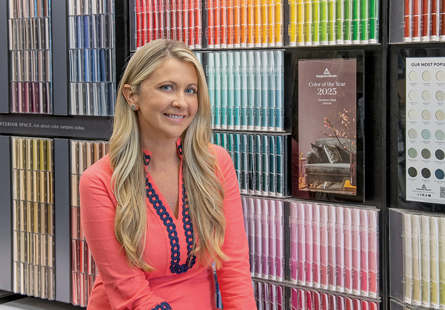
Natalie Landry
“GRAYS ARE OUT; BEIGES ARE IN.”
It has taken me two years to get comfortable saying that. For a kid who grew up watching Bart Simpson and belting out New Kids on the Block in my mom’s wood-paneled station wagon, flashes of Navajo and Linen White smacked me in the face. Instant agita.
Could it be? After almost 20 years, millennial grays are out? Yup, warm beiges, soft browns and blushes are coming in hot!
As a color consultant at Ring’s End, I’d have to say: At least 50% of our customers looking for paint advice are resisting this beige/warm era that is upon us. And let’s be honest, our customers are smart, sophisticated and on top of the trends. If you choose the right warm neutral, it will be timeless. So, I invite you all to join me in releasing cold-as-ice gray: Just channel your inner Elsa, and “Let it gooooo!”
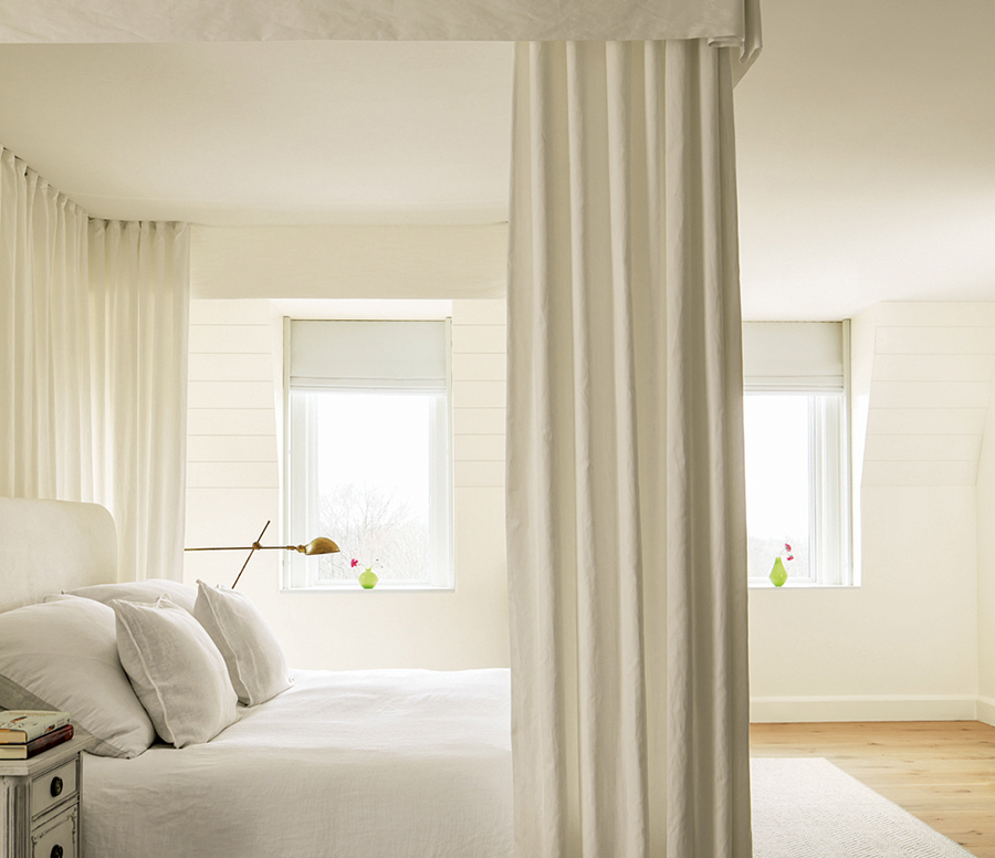
Whites compete so if choosing a white, be sure to stick with the same one throughout a space. /
Room photos courtesy Ring’s End/Benjamin Moore
TONE-ON-TONE
Whether you are color drenching an office or powder room with a dramatic color or a soft neutral, the biggest trend that’s here to stay is tone on tone—the wall color in matte, trim in satin, same color, just a different finish. And if you really want to make a statement, you can take the wall color, cut it by 50% to lighten the overall hue, and do the ceilings in a flat finish. Not only will this be easy on the eyes as you look over the room, but it will enlarge the space, making the ceiling look even higher than it actually is. This is perfect for homeowners who are working with less modern architecture, lower ceilings and sharp angles.
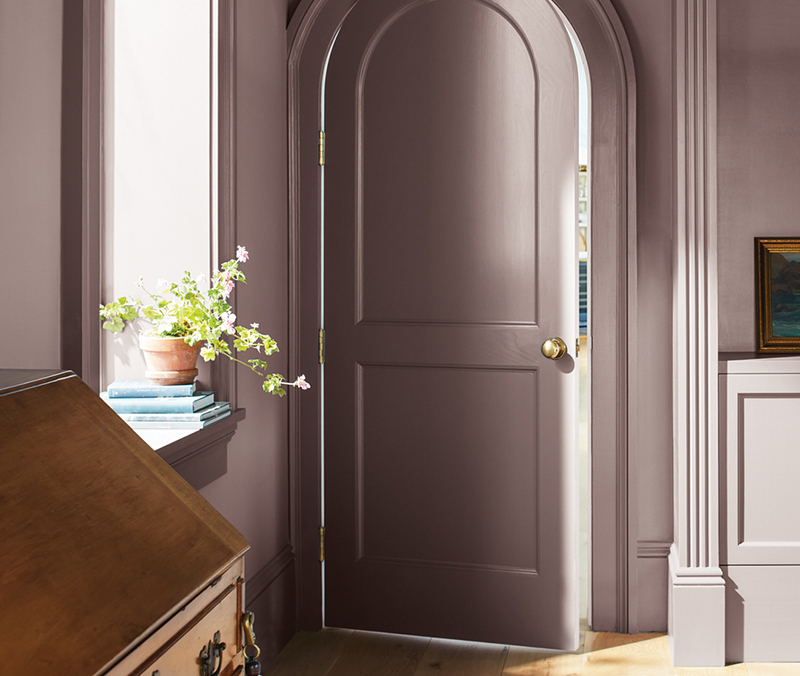
Tone on tone, the biggest trend that’s here to stay
ABOUT TRIM
Although traditional, the stark white contrast trim against a wall color is quickly losing popularity. For those who don’t want to color drench the room, I suggest we move away from using Chantilly Lace OC-65, White OC-151 and Simply White OC-117 for the trim and swap them for White Dove OC-20, Swiss Coffee OC-45, Steam AF-15 or Glacier White OC-37. These whites have a fair amount of gray in them. Wait, what? Gray? Am I contradicting myself? No, gray is added to white to tone down the yellow undertones while still keeping it warm. And remember, whites compete, so you really want to stick with one throughout the space.
SHADES OF GREIGE
Speaking of White Dove, it’s the most popular of the 3,500 Benjamin Moore colors. For good reason. This off-white shares a chip with Seapearl, Dove Wing and Pale Oak—the most popular shades of greige—the mix between gray and beige that has become a safe bet for people who can’t fully jump on the beige train. But if you’re like me and live on the wild side, let me introduce you to my absolute favorite: the Dune White 968 strip. This is the closest to toeing the line to beige as I will go. It’s the perfect Krispy Kreme, but without the calories—a warm neutral without visible yellow undertones. It makes me want to roll around on a sandy beach. After all, we are a coastal county, but don’t want a “beachy” vibe. (We will leave that look for the true beach towns.) If you want more color depth in the same family, White Down 970 and Olympic Mountains 971 share the same characteristics. Some close runner ups: Plaster of Paris CSP-185, Fossil AF-65, Feather Down 953, AF-80 and Sail Cloth OC-142.
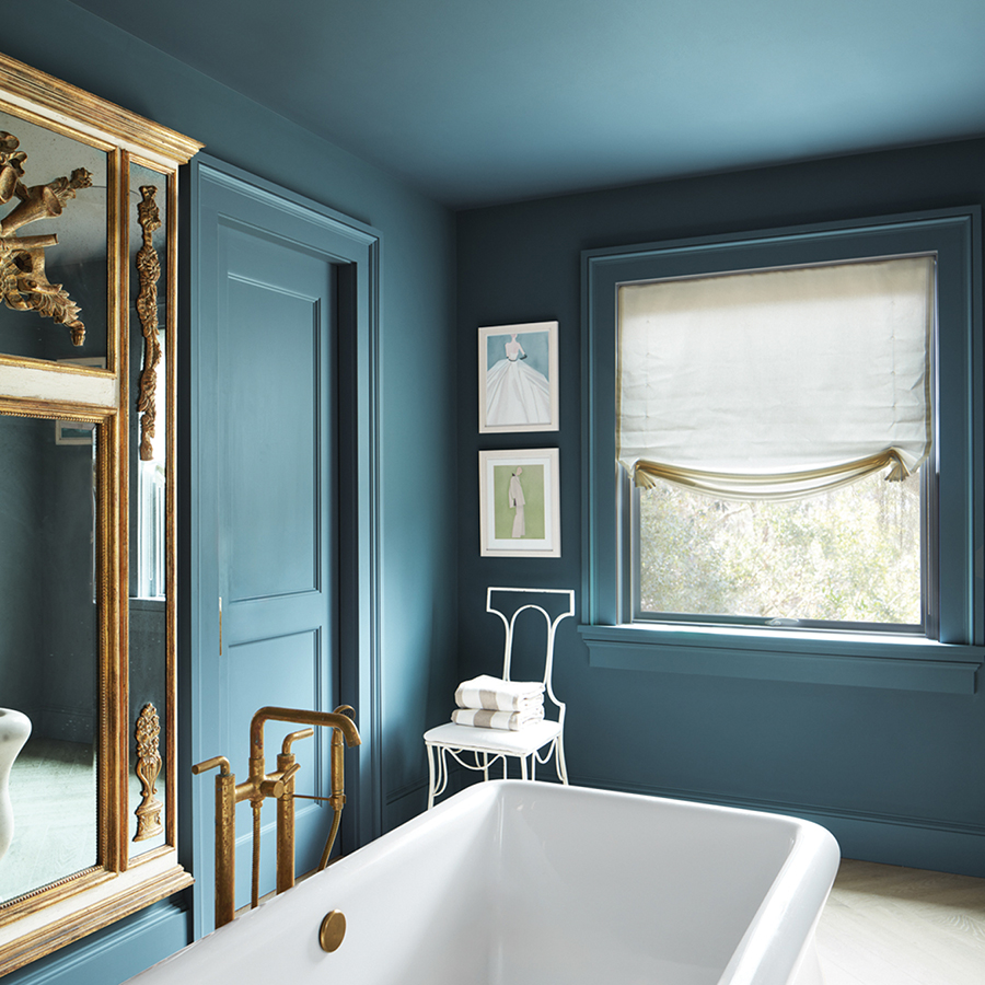
If you really want to make a statement, use the wall color on the ceiling as well.
RUSH TO BLUSH
For the recent rush to blush, think nudes with soft pink hues, taupe and ashy blushes—the kind of tones you’d see in the first colored Romeo and Juliet movie. (Sorry Margot and Ryan, no Barbie pink here.) Our customers are seeking these chips for everything from a preteen girl’s bedroom that will age with her, to cabinetry in a laundry room. Some examples: Pinky Swear CSP-340, Sonnet AF-55, Frosted Toffee 988 and Boudoir AF-190. Stepping into a space with these colors creates an inviting atmosphere, evoking a sense of warmth and comfort.
Most important of all, color is significantly impacted by its surroundings and what works for Blanche’s sunroom may look drab running through Rose’s hallways. Not “golden” at all. You have to take into account the floor coloring, carpets, furniture, natural and artificial lighting. (You can change a whole room’s color just by switching out warm lightbulbs for cool ones.) That’s why our half-pint samples should be required, not just recommended, before you paint.
Looking for help with your next painting project? Visit our Design Center at 181 West Avenue. Our talented and trained color consultants are standing by to hold your hand like Hootie and guide you through the process.
Color Continued
A few more notes on what’s current in paint:
• I’m seeing lots of greens in mudrooms and laundry rooms—everything from soft sages to moody dark greens.
• Blues and greens never go out of style but certain hues do. Avocado green from the 70’s? Be gone!
• Cabinetry painting, although pricier than regular painting, can really pack a punch. Fine Paints of Europe really blow it out of the water, especially for a bar or butler’s pantry. It’s a shellacked, wet look that elevates a space to an entirely different level of design. And when a ceiling is done in Fine Paints, it’s a real show stopper.